|
"Love"
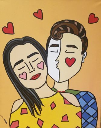
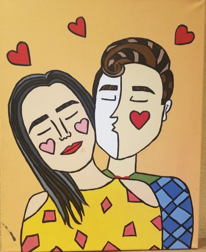
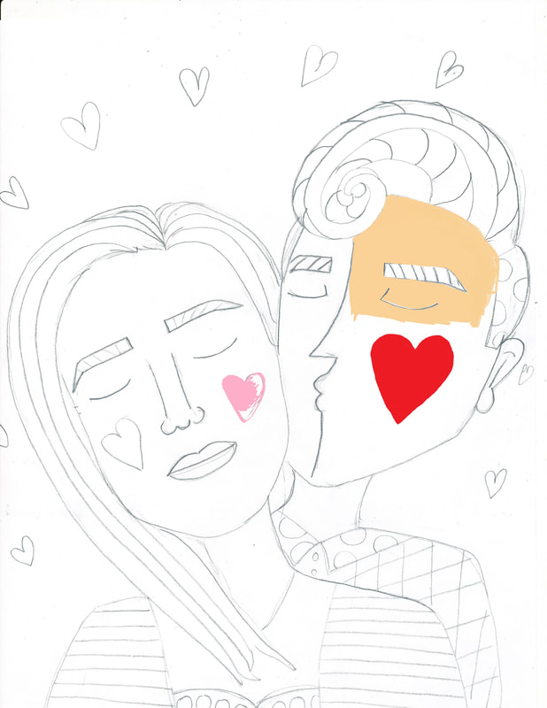
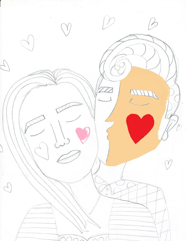
Medium: Acrylic on Canvas Size: 60.96cm x 45.72 cm November 28th, 2017 Exhibition Text: Love is a feeling that everyone should be able experience love, whether it is from family member, friends, or significant other. I wanted to portray that aside from argument and difficulties it all comes down to love. My inspiration was the brazilian artist Romero Britto. His mixture of pop art and cubism were major components in his artwork therefore wanted to incorporate that in my work as well. The other major theme that is constantly used by Romero Britto is the them of love which is why I focused on that theme as well. |
Inspiration:
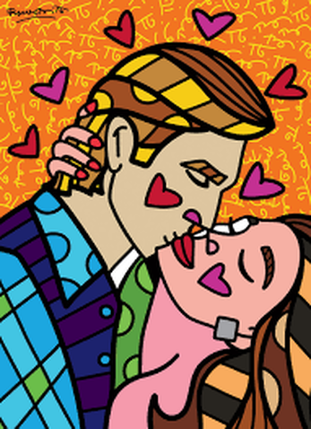
" Passionate" Romero Britto. britto.com/.
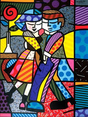
"Cheek to Cheek" Romero Britto, britto.com.
|
Romero Britto is originally from Brazil but grew up in the streets of Miami, Florida. He did not quite live in a safe neighborhood which is why in his art he wanted to show the opposite of violence and what he had grown up to knowing as normal. He was inspired to use love in his art. From a young age, Britto showed his interest in art and the desire to pursue a career in it. He was self taught, and he began his art with the use of scraps of paper and cardboard. This humble beginning has taught him to appreciate and help young artists today with limited resources. His work is known for its vibrant colors as well as the positive vibes that are portrayed from his artworks. Britto’s goal as an artist to use art as a language to communicate “optimism and love”, as stated by the New York Times. To this day, Britto has been able to accomplish huge dreams by working by huge companies like Apple and Disney. His style is identified as a pop art/ cubist style, and the majority of his works are to portray love and peace, quite the opposite of what we see today. His use of bright colors and flat tecture resemble the pop art movement. His use of multiple geometric shapes resemble the cubist style. Also going back to the theme of assimilation and love, love is a feeling that needs to be assimilated by the significant other. The artwork to the right is titled “Passionate”. This acrylic painting is portrays the expression of love between a male and a female. Britto is known for his positive take of negative events that are going on during the time period. Interestly when the rates of divorces keeps going up, Britto pictures the happiness of marriage. Britto could have use this artwork to persuade marriages that at the end of the day there is always love, and that love is essential for the successfulness of a marriage. It’s reminding your significant other that you care and that you love. Making that person feel protected. That is why Britto had the man kissing the women on the cheek instead of in the lips because it shows care and protections. There's multiple different things that need to go into a relationship. I wanted to incorporate love how love has the ability to change your life drastically.
|
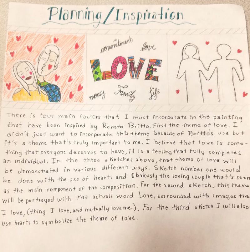
Planning:
|
When I began my planning I already knew who I wanted my artistic inspiration to be. I knew that Romero Britto was the one that I wanted to recreate. Therefore I wanted the themes as well as the style to remain constant. I chose the work by Romero Britto of " passionate because it was the one that I mostly identify with. I did a total of three sketches that were all option for my work. I chose the first one because it the one that I esthetically likes the best and the one that would also let me incorporate as much as Brittos does with his art.
|
|
Process:
|
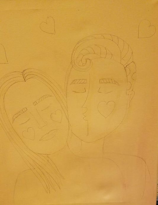
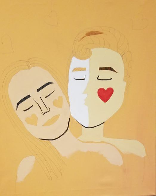
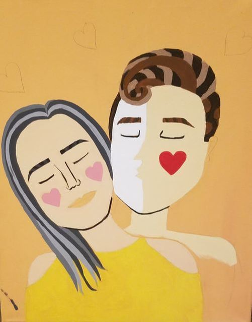
Before drawing my image onto the canvas I first painted the canvas with a warm light orange. I used the orange because it is a warm color and what I want to transmit with my work is warmth and love. Orange is also associated with creativity and success, success in a relationship and I wanted it to stimulate my imagination as I worked on the paint. Then I chose one of the sketches that I had initially created in the planning process and I recreated it by hand on the canvas. The final product of that can be seen in the first image to the left. Then I began painting. I first began by creating the flesh colors. Flesh colors are probably the hardest to make and I wanted them to be on the spot. I gave the faces about 3 layers of paint in order to create that flat surface with no streaks. I then outlines the eyes and eyebrows and nose so that those wouldn't get lost underneath the layers of paint. I added then the shirts that would be worn by the characters. I decide to do the shirts first because there would be hair that laid on top of it. I thought it would be easier to pint on top of the shirt other than try paint in between the strands of hair. I then painted the hair. At first I was not fully convinced with the hair from either. I thought that the guy sort of looked like a skunk and I also though the lady looked like an old lady. That is why I replaced the light grey hair for a dark brown and I enjoyed that a lot better. I decided to keep the guys hair because once the black lines were added it really defined each shape and it looked a lot better. Then it was just up to the small details to complete the composition.
|
Experimentation:
|
Before deciding to do a acrylic painting, I was considering doing a digital illustration. To the right are screenshot of what I tried doing, yet my lack of experience with digital illustration made me change my mind. I began trying to accomplish my piece with the A6 Photoshop program, and after watching video and more video in order to get it working it still was not helping at all. Then I decided that I can probably sketch my image onto a piece of paper and scan it, so I did that. I then opened the scan image onto the program paint. This program I have been using ever since a kid, and that is where all my imagination started. The pictures to the right show the process that I made until I gave up. I stopped doing this method because I did not have the versatile to create my own colors like I would with paint. Which is why I went bac to the acrylic on canvas. If I would have continues this method, I believe that the image would be a lot more similar to my artistic inspiration, yet I think that I would have not been happy with it.
|
|
|
Reflection:
|
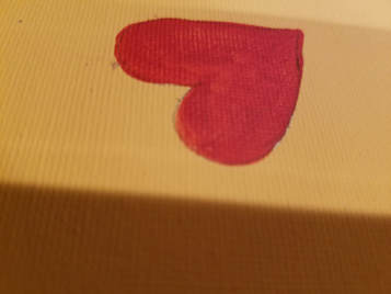
Out of all my project this was definitely the hardest one to accomplish. It's simplicity hides hard work and a lot of hours as well. What's really hard to accomplish is the sharp edges that each of the figure need. Also the medium used gave me lots of difficulties. Using acrylic paint ca be quite complicated at times, especially when I am working with a budget and have to get acrylic paint that are very water down. To the right is a picture of three layers of paint that I gave one of the hearts and there was still streakiness. I wanted to make sure that there was hardly any streak made from the brush so that is can resembles my inspiration work as well as possible. Overall, I am very happy with what I have accomplished. One thing that I will change is going back in and define those black lines that outline everything in the composition. Those black lines really added a "pop" moment to my painting and it is the best decision I have taken. I also would change the fact that I did not incorporated as much as the cubism movement as Romero Britto does. That is also something I would go in and change.
|
|
ACT QUESTIONS:
1.) Clearly explain how you are able to identify the cause-effect relationships between your inspiration and its effect upon your work.
I believe that the connection between the my artistic inspiration and my art work is really clear. There is certainly a connection between the style, using both the pop art and cubist art style.
2.) What is the overall approach (point of view) the author (from your research) has regarding the topic of your inspiration?
The majority of Romero Britto's art work is focused on the theme of love. His themes and his art style correlates, the use of colors is in correlation with the bright happy themes that he uses for each of his pieces.
3.) What kind of generalizations and conclusions have you discovered about people, ideas, cultures, etc. while you researched your inspirations?
I like to focus a lot on the American society because I like to know what surrounds me, and I know that American people always seek for sad and negative news to entertain, and I thought it was a good idea to step outside that idea and portray something happy, something such as love.
4.) What was the central idea or theme around your inspirational research?
The central idea of Romero Britto was to spread love and provide the public with a happy view of life.
5.) What kind of inferences (conclusions reached on the basis of evidence and reasoning) did you make while reading your
research?
I made the conclusion the love is not only a feeling it is a right. Everybody should be able to feel loved.
