
|
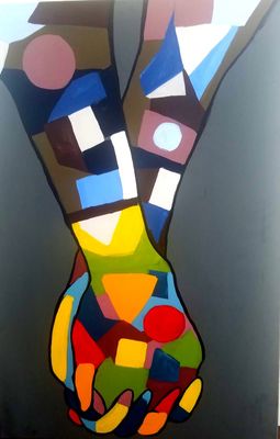
"New Beginning"
Medium: Acrylic on Canvas Size: 91.44 cm x 60. 96 cm Exhibition Text: This piece resembles Pablo Picasso Guernica in multiple different ways. Although Picasso used the Guernica as a protest against war and advocating for peace, I decided to do an art piece that gave those affected by the recent natural disasters that have impacted the Caribbean including Puerto Rico and the earthquakes that have impacted Mexico. This peace was created to show that although there it might seem grey and solemn, things will better because there is always a rainbow after the storm. |
Inspiration:
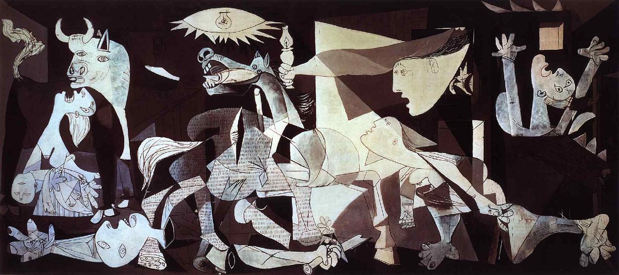
Picasso , P. (1937). Guernica [Painting]. Museo Nacional Centro de Arte Reina Sofia, Paris, France.
|
Due to multiple natural disasters that have been going on had inspired me to create a piece of art that evoke faith that everything will get better. Both my homes, Mexico and the United States, have been victims of these disasters which is why it is heart felt. There is a feeling of impotence of not being able to go to the affected areas and help out with my bare hands. My family decided to just send some money to help the ones in need and that is all we can do, yet I wanted to create an art piece that would send those in need a message and tell them that there is always a rainbow after the storm. I was also greatly influence by the artist Pablo Picasso, specifically his piece "Guernica". Pablo Picasso was a Spanish painter, sculptor, printmaker, ceramicist and stage designer and was considered one of the most influential artist of the 20th century. He worked under the art movement of cubism. Through the use of geometric shapes he created one of his most famous art pieces, "Guernica" This piece was created as a response or as a statement after the Nazis bombed Guernica during the Spanish Civil War. Guernica shows the tragedies of war and the suffering of civilians who were affected by the bombing. His work is considered as a protest anti-war piece that advocated for peace. The lack of color emphasizes the drama and sadness, which is a method that I used to portray the mourning of the communities affected by the natural disasters. But the disaster have not only inspired me to create a piece that gives the affected faith but also to recruit everyone around the world to unite as one and help those in need.
|
Planning:
|
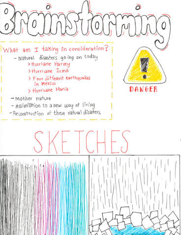
While brainstorming ideas I always had in mind to create a piece of art that reflected the natural disasters that have been going on lately. There were multiple different ideas that I had in mind in order to visual recreate this idea. For my first sketch I wanted to represent how the world might seem grey and sad and solemn but there will be color and there will be life. This is represented by a fade of colors rom a black color scheme to the colors of the rainbow. I also create a sketch where the top half of the canvas would be multiple different shades of grey and the middle would be covered with geometric shapes that represent the destroyed building due to the earthquakes and hurricanes, and under those geometric shapes there would be a burst of color that represented that under all the debris there is life and there is color that we should all work for. I ended up choosing one that advocated for the unity of the world as a whole in order to help those in need.
|
|
Process:
|
|
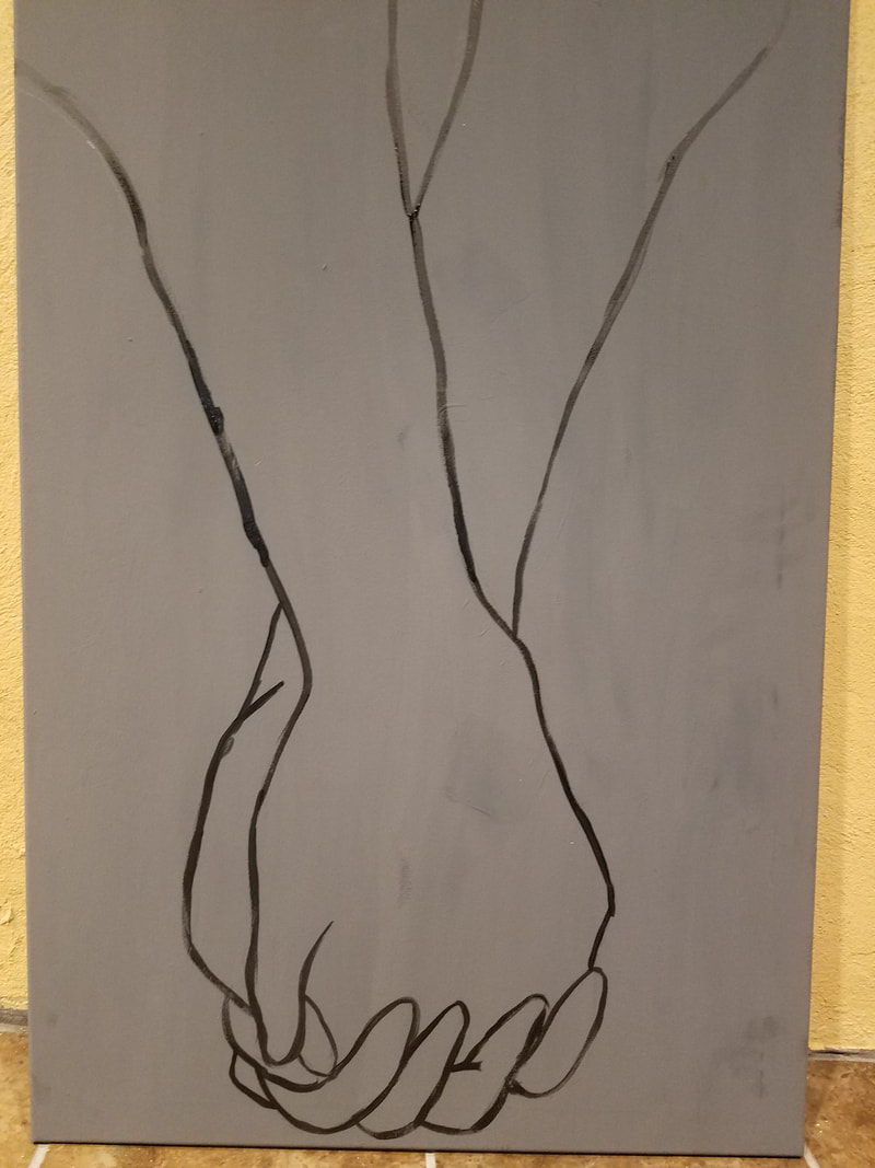
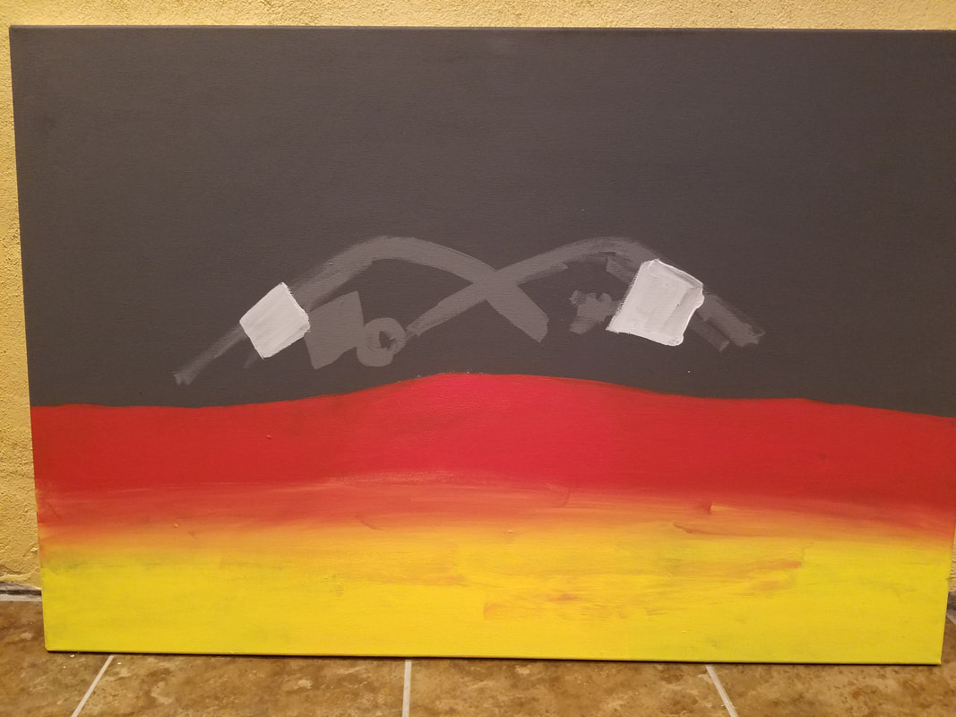
First I began by painting the background in a dark grey shade that showed the solemn tone that I was trying to create which resembles what those who are in need see at this moment. Then once that was all dry I sketched the two hands holding each other and went over that sketch with black paint so that the image would not disappear and therefore I had a better visualization of the boundaries I had where I would create the geometric shapes. One thing I did notice was that once I started adding the geometric shapes, the lines were lost. Which is why at the end I traced that line over again to create a more opaque hue. Once that was sketched down I began to create geometric shapes with multiple different colors. Notice how the top forearms of the hands have less vibrant and more solemn tones. This was done to create some type of movement as we move on there will be a better life and a better future. Once I was done with the top portion of the canvas I began to create geometric shapes with the use of vibrant colors. The vibrant colors were used to create a transition into what is seen as a brighter future.
|
Experimentation:
|
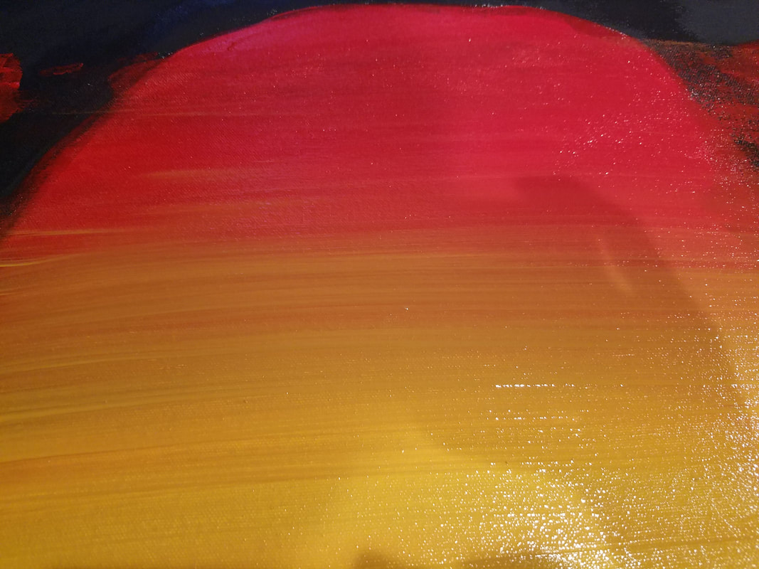
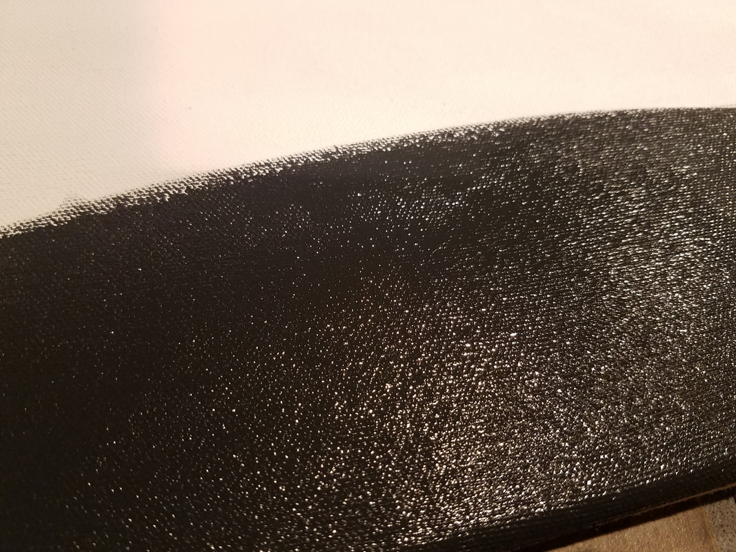
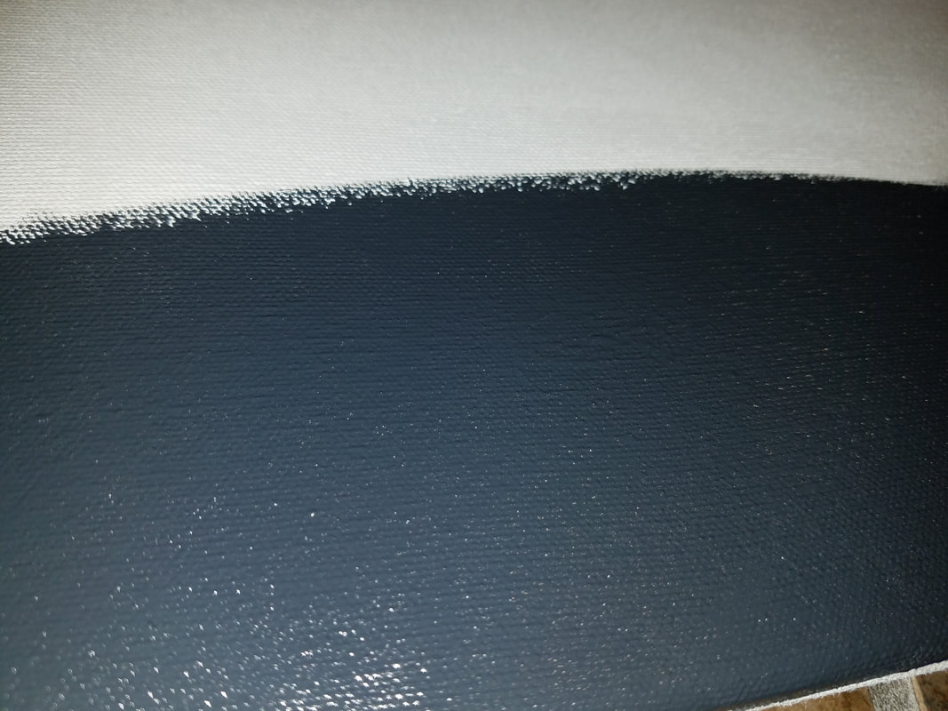
At the beginning I had in mind a completely different idea of what I wanted to do. At first I had gone with the idea of creating geometric shapes that represented the debris left behind by the passing of the hurricanes and the earthquakes. First I began by choosing between the two colors that are displayed to the right, I began with the darker color as the background and realized that it was too dark which is why I chose to go lighter. Also once I began the blending of the color, I really wasn't happy with the way it was looking. No matter how much I looked at it I was not convinces which is why I switched paths and began the painting over. I covered the blended section with a lighter grey and then sketched the holding hands.
|
     |
Critique:

The obvious connections between these two are the use of geometric shapes. There is sharp lines that distinguish each shape and give the illusion of distortion but there is still a sense of cohesion among the figures. Also, both paintings are used to advocate the help of a community who is need due to disasters going on whether is war or natural disasters. Although Picasso's piece seems to be concentrated toward the negatives and not necessarily viewing a brighter future, it is used to show what the daily life of these citizens look like. While on the other hand, I used my piece to bring the world together for a great cause. It is recruiting the help of all people, all shapes, all colors, all ethnicities, to come together as one and build that brighter future for the next generations.
|
|
Reflection:
Although I am content with my piece, I think there can be some things that I can do to better the composition. I think that is hard to differentiate the two hands holding each other which is why I am considering adding a bolder color as the outline of the two hands. Maybe the use of a white outline would be easier to distinguish. Also I think that the connection between the Pablo Picasso piece and my piece is there, but maybe if I created a piece showing the devastation or even take another path and show how we should start caring about the earth a lot more. I could have create a piece where it showed the furious sea and furious earth. Although there should be some edits to my piece, I believe this is much better than what I had initially.
ACT Questions:
1.) Clearly explain how you are able to identify the cause-effect relationships between your inspiration and its effect upon your work.
Both my painting and Pablo Picasso's are used to advocate for a united and peaceful world. Picasso wanted to portray a piece that aware all other communities of the war that was going on and they were just killing innocents.
2.) What is the overall approach (point of view) the author (from your research) has regarding the topic of your inspiration?
Pablo Picasso did not necessarily want to address the same topic I did. He on the other hand wanted to let the world know that war was going on and that they were killing civilians who have nothing to do with the war.
3.) What kind of generalizations and conclusions have you discovered about people, ideas, cultures, etc. while you researched your inspirations?
I think that I can conclude that there is a lot more unity that expected. I think that lately we have seen so much discrimination in the United States that we forgot that there is hundreds of other countries in the world who are willing to help out, and they are willing to come together to rebuild these cities and towns that have been destroyed.
4.) What was the central idea or theme around your inspirational research?
The central idea was to depict that unity makes a stronger force, and that unity leads to success.
5.) What kind of inferences (conclusions reached on the basis of evidence and reasoning) did you make while reading your
research?
I made the inference that people weren't want to help out these countries that are need. I inferred this because of the revelation of racism and discrimination in the U.S. especially with the recent comment going around by the American Government.
