|
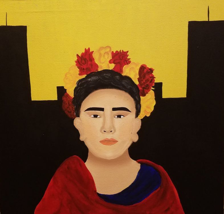
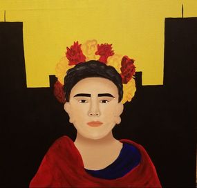
" In the City"
Medium: Oil and Acrylic on Canvas Size: 60.96 cm x 60.96 cm Date: September 22nd, 2017 Exhibition Text:
Assimilation is something can be seen all around the world, especially in the United States, a country considered a melting pot of different cultures and ethnicities. My own family migrated from Mexico to the U.S. in search of a better future for their children. Although it was very difficult for them to assimilate to a different language and a different culture it is even more difficult for their children to assimilate to one culture that we begin creating our own standards of living. That is why for this piece of art, I decided to use one Mexican icon, Frida Kahlo, to symbolize the Mexican heritage and a city background to represent living in the United States. |
Planning:
|
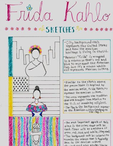
I created three different sketches that represent the different ideas that I had to portray one theme, assimilation. For this first project I wanted to take a personal situation that most of my family has gone through, which is why this piece of is so special for me. To the right are the three sketches along an explanation of the meaning of each symbols, and a template that I would eventually follow explaining the colors and techniques that would be used. I decide to use my first sketch because it was the most aesthetically pleasing as well as it has the more straightforward meaning for the viewer to understand. I also decided to use one common artistic inspiration and that was Frida Kahlo. Frida Kahlo is an icon of the Mexican community which is why there was no one better to use as inspiration for this piece.
|
|
Artistic Inspiration:
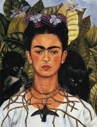
Frida Kahlo is a Mexican icon is well known for her self portraits. Kahlo represented the Mexican culture with These self portraits included bright vibrant colors and ironically the meaning behind most of her paintings were about pain and suffrage. The community considered Frida Kahlo's work inspired by the surrealist movement, but Frida Kahlo her self denied this by saying " They thought I was a surrealist, but I wasn't. I never painted dreams. I painted my own reality. " Although Frida did not consider her self a surrealist painting there are certain aspects of her art that are very similar to those who characterized the surrealist movement. For example the desire to push against the boundaries of socially acceptable behaviors and traditions in order to discover the artist true nature, and that is something I decided to incorporate in my piece of art by portraying the different symbols that characterize the two cultures. This is also seen in one of Frida's painting names " Dos Fridas" seen to the below. In this painting she combines her feelings as she portrays the contradiction of feeling that she has and in a sense a type of lost of identity because she does not know who she really is. This loss of identity had a lot to do with her relationship with artist, Diego Rivera, and their unstable relationship. Yet there is no reason to challenge something that the artist her self stated, the quote that was mentioned before inspired me to pain my own reality. I'm not painting what I wish my residency in this country is like, I am painting the conflict of living in between two completely different cultures and assimilating to one of them or even combining both culture and forming a brand new culture of your own.
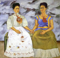 Kahlo, F. (1939). The Two Fridas [Painting]. Museo de Arte Moderno , Mexico City . Kahlo, F. (1939). The Two Fridas [Painting]. Museo de Arte Moderno , Mexico City .
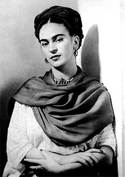
I combined aspects of these paintings that are influenced in my painting. The structure of my piece of art resembles Frida Kahlo's Thorn Necklace, yet the meaning of my piece is really similar to the one in " Dos Fridas". Some techniques that Frida used was her use of bright vibrant colors which is great influence to my own work. As well the high contras between the background and foreground.
|
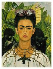
Kahlo, F. (1940). Thorn Necklace and Humming Bird [Painting found in Harry Ramson Center, Autin, TX].
|
Process:
|
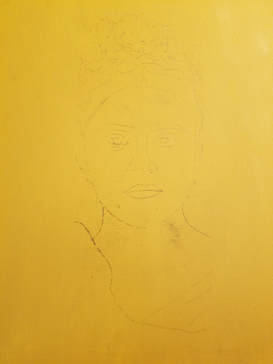
I first began with painting the background. For painting the background I used acrylic to paint because acrylic paint dries a lot faster than oil paint. In the image the background appears as yellow background, but in reality there's a touch of green to it. I wanted to paint the background a bright green because Frida Kahlo used bright hues in her painting. Next I used the graphite transfer method to transfer my initial image onto the canvas. I printed the image that I wanted in order to keep the proportion accurate. When using this method, the limitation is that it takes much longer to transfer the image compared to using a projector and projecting it onto the canvas. This is because there is a lot more steps to it than if I were to project it. But the main idea of transferring the image is to create a template so that I can apply the paint and from there add dimension.
|
|
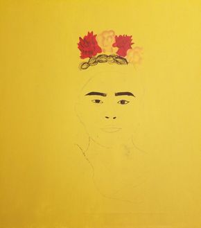
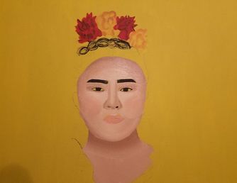
When beginning to add paint I decided to start with the components that would be done in acrylic paint first. I decided to do this because of the time it takes for acrylic paint to dry, and I figured that doing this would prevent me from being messy in case I accidently painted acrylic paint near oil paint that was still not completely dry. I began painting the flowers that and then moving on to eyebrows and eyes so that when I started painting with oil paints the pencil would not disappear therefore I had an outline to follow.
|
|
|
To start of the with the oil paint I began with creating a main shade which is seen below to create a shade that I would later modify either by adding white or adding brown to lighten it or darken it. To this initial color I added more white to create the highlight shade that is seen to the left. Using different shades would help create a dimension to the face so that there was not a flat face.

In this mixture there is a large amount of white oil paint mixed with a relatively same amount of yellow in it with a pea size amount of brown and the smallest amount red to add warmth to the skin tone.
|
|
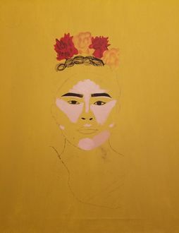
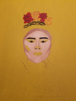
In the image to the right, I began adding contours as well as the middle tone to add a transition from the highlight onto the shadows. I outline each of the contours to add some more dimension into the face as well as some color so that the face wasn't so white. The contours are placed around the perimeter of the forehead an onto the cheeks to create cheek bones. Also brought down to the jawline to differentiate from the face to the neck.
|
|
|
In the picture to the left you can see the how the colors are being blended. You can no longer see the different lines of colors that were seen in the image above. You are able to see the dimensions of the facial features. One thing that I disliked about this product was the face was a lot darker than what I wanted which made me go in again with more highlights. I also decided to not bring the contour of cheekbones so far out, and just kept it for approximately an inch from the perimeter of face into the cheeks.
|
|
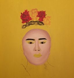
Before starting this project I worked with both mediums of oil and acrylic. I decided to use the oil paint in this case because of the completely different results that oil paint allows me to create. In the picture to the right you can observe a smooth blending that is coming together after a few layers of colors. I also added some color to the cheeks which is one of Frida Kahlo's iconic look. Although the blending is starting to come together, the forehead is still not blended enough because you can distinguish the breakage between the highlight and the contour.
|
|
|
|
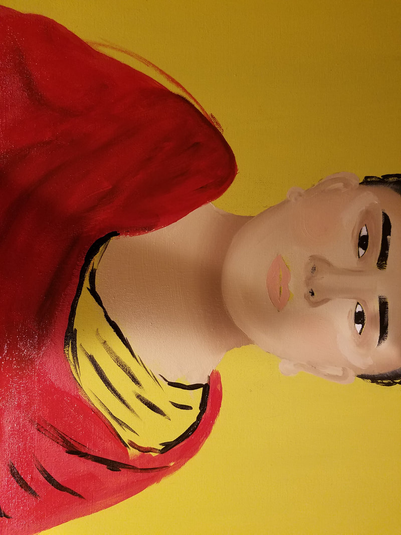
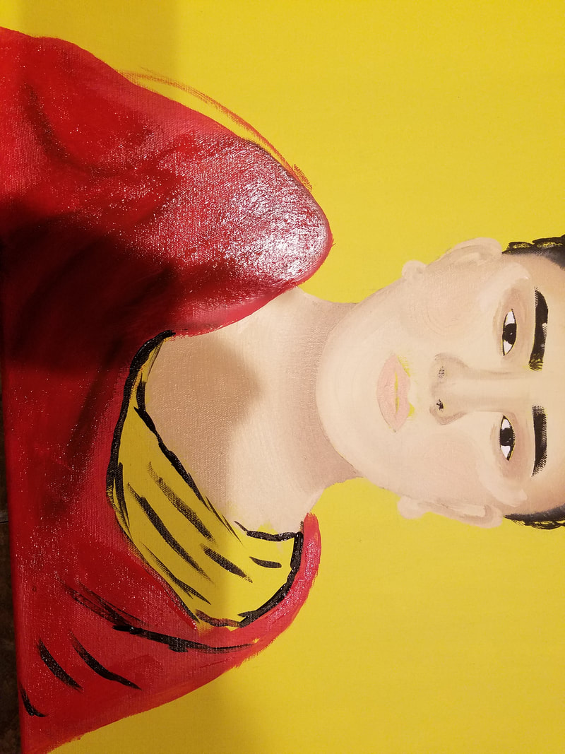
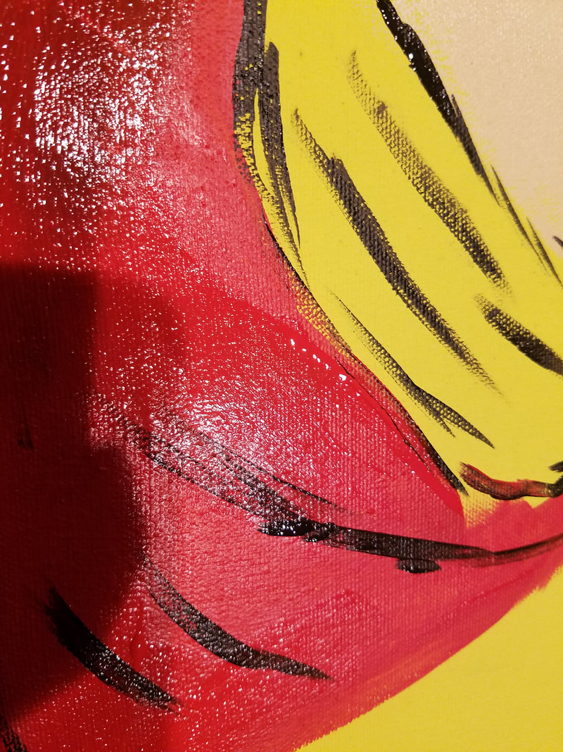
To the left are some images of how I began blending to create some texture on the "reboso" I began with a coat layer of red paint. Then I added black acrylic paint to add the creases and blended that with the red paint. When I did this I realized that the creases were to defined which is why I added watered down red paint and layered on top which still allowed me to see the crevices and folds of the reboso but they were not so defined.
|
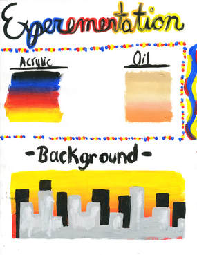
Experimentation:
|
At the beginning of the process I wanted to experiment with the different mediums which is why I testes blending with acrylic and oil paints. I thought that the blending was facilitated with the oil paints, but drying time took days which would cause a problem. If I painted the background with oil paint then it would take a longer time for me to start the actual figure which is why I went with the acrylic paint. At the beginning I only painted four flower on her head. I thought that it was missing some more flowers to complete the look which is why I added more flowers to her hear. The addition of these added more vibrancy because there was more contrast between the lime green color and the red flowers, as well as the black silhouettes of the buildings in the background.
|
|
Critique:
|
There is a lot of differences between the two paintings. The first difference between the painting is the background. Frida Kahlo has a very urban, natural, background. On the other hand, I have a city background to represent the city, and how the Mexican culture in now living in huge cities which is really different to the small town that my parents were used to. Also the Frida figure that I was inspire by is a lot more "modern" notice how the eyebrow of the painting to the right are much more defined and shaped. This represent the American culture and how at such a young age females being plucking their eyebrows and wearing makeup.
|
|
Reflection:
|
I am really happy with the final results. I believe that the meaning that I wanted to get across was really done in an effective way. I think that I also did a good job making the connections between Frida Kahlo and myself. There's an obvious resemblance between the two paintings in the way that it is set up and the way that person in my painting is has certain characteristics that symbolize Frida Kahlo. For example the flowers in her head and the bright cheeks that characterize Kahlo. One thing that I will change is the background. I will add more building and I won't make them similar because it really does not look right. I will also do some of the building in different shades as well as add a sunset of something to resemble the city of Milwaukee as seen to the right.
|

(n.d.). Retrieved September 22, 2017, from https://www.google.com/search?safe=strict&tbm=isch&q=city%2Bof%2Bmilwaukee%2Bsilhouette&spell
|
ACT Questions:
1.) Clearly explain how you are able to identify the cause-effect relationships between your inspiration and its effect upon your work.
There are certain aspect between the paintings that clearly resemble. First of all, Frida Kahlo is a symbol of the Mexican culture which is why she is my main inspiration when talking about my own culture.
2.) What is the overall approach (point of view) the author (from your research) has regarding the topic of your inspiration?
.Frida Kahlo represented her culture with joy and pride, but in her paintings she always reflected upon two completely different worlds, the world happiness and the world of sadness. I decided to depict the world in between two cultures.
3.) What kind of generalizations and conclusions have you discovered about people, ideas, cultures, etc. while you researched your inspirations?
I don't like to talk about stereotypes and yet most of the symbols I used in my painting were stereotypes of the Mexican culture. They are not necessarily offensive but they are sure stereotypes.
4.) What was the central idea or theme around your inspirational research?
My central idea was assimilation, and immigration. I wanted to depict the adjustment of life that has to be made when migration to another country, and yet how you hang on to those customs and traditions.
5.) What kind of inferences (conclusions reached on the basis of evidence and reasoning) did you make while reading your
research? I have come to the conclusion that living in a country that was once foreign to your ancestors does not mean you are foreign. I am a citizen of the United States and no one will take that away. Also, it is not about choosing a culture it is about creating your own.
